31 October 2011

creative pause prompt #8


Creative Pause Prompt #8:

Take a picture of something at different times of the day.

Maybe once in the morning, maybe once in the evening.

Look at how the light changes, how the shape seems to change, how the colors are altered by something as simple as the time of day.


Creative Pause Prompt is a weekly blog post series that delivers a low key, no stress prompt to help you keep creativity in your schedule no matter how busy you are. You can read more about it here.

30 October 2011

five year anniversary of where i stand sunday


 Wowsers. How time flies. Especially when you're putting your feet all over things.

Wait, that sounded wrong. But you know what I mean. Five years. Really? I can't believe that its been that long that Where I Stand Sunday has been trucking along.

If you weren't there at the very beginning back in 2007, here is the original post that started it all.

And the very first photo and caption:

Michigan is trading in summer for autumn. The weather is growing cold, its raining and the leaves have become victims of gravity. It won't be long before my blacktop driveway is covered in ice rather then spotted with leaves.


I have to admit, its still one of my favorites. (Its autumn, that endears it to me right there.)

The idea behind the whole project was that we spend way too much time whizzing by all the things in our life. If someone asked you to close your eyes right this second and describe the room you are in great detail, would you be able to do it?

I think we get used to our surroundings and don't realize just how special our environment really is.

I really never thought the essay would last this long and I've played around with varying it with other things every once in a while. In the end, I kept coming back to it. So while there are holes in the essay's collection, its been a constant presence.

A friend asked if I'm going to end it now. Its been five years after all. Honestly? The thought hadn't occurred to me. I've no plans to discontinue it any time soon. Its become a companion, something that is part of the schedule and makes me slow down. (Although I get weird looks for staring at the ground so much.)

 So without further ado, I bring to the first photo of Year Five of Where I Stand Sunday:


Michigan is flirting with winter. Frost is thick and clinging and feels a little like a warning of things to come. A strange melody of water drops as the thin ice flees under the morning sun and the rustle of colored leaves shuffling to the ground create a backdrop that can only speak to the impending winter.


Where I Stand is an ongoing photo essay examining the different places I spend my life standing. Too often we take for granted the everyday places we spend our lives walking on. The ground we tread on has its own stories to tell. 

26 October 2011

leave it whole? cut it up? stitch it? what would you do?


After cleaning the rest of my studio up, my design board was really starting to annoy me. I've tacked so much stuff up there that its impossible to use it for what its really there for in the first place.

I decided that the only way I would force myself to deal with it was to take it all down and pile it on my newly cleaned off print table. It'll bug me even more since I just cleaned it off and its also my primary work space so its impossible to let things linger there for any length of time.

Here's part of the pile:


 I really have to break the habit of tacking paper items up there. I've even started tacking up images from catalogs of the style of house I love (I dream of owning a craftsman one day, Restoration Hardware catalog is great for that kind of vintage inspiration). Design board = artwork critiques. I must remember that.

While cleaning I came across this piece:


I put this together quite a while ago when I was going through one of my "I must work larger" phases (which I still haven't discredited but keep ignoring as I plod forward with new work).

After I printed the orange squares, I stalled. For many reasons. Here are a few:

1) I'm not sure I like the orange squares anymore. I don't know that they add anything. I could cover them with more fabric and it would be like they were never there but I don't know if I want to do that.

2) I don't think stitching will do anything good for this piece. I just don't think it needs it.

3) Its lacking a focal point. But does it need one? Could I just enjoy the colors and shapes and leave it as a soft abstract piece?

One thing this piece did teach me is that when I work larger like this I won't be working on felt. I don't like the stiffness it adds so I need to decide what the base layer will be but rolling this up and shipping it anywhere if it was ever accepted into a show? Wouldn't be much fun.

I'm feeling like I want to at least decide its fate. I'd kind of been thinking mean things about it when I first started digging through the layers tacked up on the board. I'd have off ideas about chopping it up into smaller pieces or tucking it away in a closet or printing the snot out of it.

But now I've no idea. After I tacked it up to take this picture, I felt an attraction to it again.

What would you do?


25 October 2011

sometimes its good to be wrong


“It is better to have enough ideas for some of them to be wrong, 
than to be always right by having no ideas at all.”  

— Edward de Bono


I spent time this past Sunday cleaning up and organizing the studio. Its a well documented battle here on the blog. Luckily I've finally won the upper hand and while it does tend to run away from me on a consistent basis, I'm able to beat it back into submission in about an hour, two if its really bad.

I took my time this last clean up because I was beginning to accumulate the dreaded piles. You know what I'm talking about - the I'll-just-stack-these-here-and-clean-them-up-later-when-I-feel-like-it piles. I was creating a collection. So I sucked it up and showed no mercy (my weapons of choice are irritation and a black garbage bag, works every time).

 I noticed something as I was sorting through them - there was some crappy artwork scattered in among them. A lot of stops and starts that never got their footing and just went on the wrong side of any effort I threw at them.

And then the quote that's shown up top at the beginning of this post surfaced on one of my web searches today and I thought to myself, "Good point."

I don't mind making crappy work. It means I'm thinking and trying to push and I can't expect everything to work all of the time. If I did I'd drive myself mad and never step foot into the studio again. Not some place I want to go.

I ran out of steam before getting to my design wall. I've developed the habit of tacking up notes and other papers on there as well, something I really shouldn't be doing because my design wall is quite petite.
I'll be honest, I looked at everything up there for a while. I sat in my chair and studied it and kept trying to work out some of the things that were being stubborn in a couple of pieces. In the end, I walked away and left it for another day. 

I seem to be in a quiet stretch right now, kind of contemplative but more then anything - content. Jackie and I got word the other day that we will have a show in 2012 at a gallery we submitted to so I think I'm starting to prepare the studio for the new work I want to make for that. Its like a slow steady exhale before the frenzy begins.
The quiet before the storm.

Its totally my favorite stage in the creative process. :)

24 October 2011

creative pause prompt #7


Creative Pause Prompt #7:

Spend some extra time with your dog, cat, bunny, bird, fish.

Hug them (if you can, the fish may not like that), take them for a walk, give them a cuddle. Reconnect with them.


Creative Pause Prompt is a weekly blog post series that delivers a low key, no stress prompt to help you keep creativity in your schedule no matter how busy you are. You can read more about it here.

23 October 2011

where i stand sunday


The change in the temperature has caused me to turn inward, quiet, contemplative. Everywhere I turn I'm pulling things back out into the open for layering and warmth, a comfortable kind of armor to ward off the sharpness in the air. I'm reminded as I move through the day without changing out of my pajamas that stillness has its own special things to say, to teach.


Where I Stand is an ongoing photo essay examining the different places I spend my life standing. Too often we take for granted the everyday places we spend our lives walking on. The ground we tread on has its own stories to tell.

19 October 2011

stretching forward


1. Highway 127 - California, 2. Highway 250 - Reimaged, 3. Highway lights, 4. Highway 87, Navajo County, AZ


Its a long moment of concrete limbo, the part of my drive home every day that stretches forward and endless and strangely without a sense of time. Its the shortest leg of the trip, a blip on the journey. Yet the steady rumble beneath my car's tires, the gentle blurring of the view out the window are enough to transform it into a mini bermuda triangle where time ticks with an incredible laziness.

17 October 2011

there's no place else i'd rather be

Being an artist has given me a lot of gifts. But this past Sunday is an example one of my absolute favorites.

I got to spend the day with eighteen very talented artists. It was my Remnants Collage class and I couldn't be happier. The day was beautiful, the art and paint were flying and there were big smiles all around.

:)

But here, look for yourself:


See all that fabric? Swoon. I swear, I'd be talking to someone while they were working and I'd think, "Oh look at that fabric! Wait, focus Lynn, focus." (I'm an addict, it can't be helped.)

There were tons of collages popping up everywhere:

Aren't they incredible? I mean really, the depth on what everyone was making was really fantastic. (These beauties belong to Deb and Kathy. I wanted to steal them.)

My studio and washout area now look like this:


(What? You don't hang your thermofax screens from your shower curtain rod?)

Its such a treat for me to get to spend the day teaching. Every time I do it I always wonder why I take so long to schedule things. Truth is, the day job gets in the way too much so my in person teaching is incredibly sporadic.

And there was lots of help from several lovely ladies that made the day perfect (thanks Kate! thanks Mary! thanks Sandy!). Its such a great feeling when you can be on a team that creates something so special.

I had such a wonderful time that I decided I don't want it to stop and since we all live in the wonderful age of super technology, I'm making it a priority to translate my Remnant Collage class into an online offering. It will most likely pop up early next year (which isn't so far away when you realize that we are halfway through October already) but its going to make it.

Thanks everyone! :)

creative pause prompt #6


Creative Pause Prompt #6:

Drive with the windows down.

(Let your hair get messed up.)


Creative Pause Prompt is a weekly blog post series that delivers a low key, no stress prompt to help you keep creativity in your schedule no matter how busy you are. You can read more about it here.

13 October 2011

the art of leann meixner


I thought maybe you'd like a little look at some new artwork that I just picked up.

You've heard me mention my friend Leann on the blog before. She's an outstanding artist. You can pretty much give her an scrap of fabric and a popsicle stick and she'll make you something really cool with it (like MacGyver but artsy and with blue hair).

She recently made a group of mini assemblages featuring her little stuffed and stitched friends for a show she and Joan did at The Liberty Street Brewing Company.

I got a chance to catch the show when it was up and it took me about a nanosecond to point out the two pieces up above and claim them as my own. The one on the right is living in my studio right now. Its a lovely rich red inside (my camera just wouldn't give up the color, sorry) and she's printed the word "strive" on it. Love that word.

The yellow one with stars is a birthday giftie for a friend and has the word "shine" on it.

Leann has assured me that she'll be posting her little boxes online in a few weeks and I'll be sure to let you know when she does. Her work is so special and I love all of it (was a miracle I only came home with two boxes to be honest).

11 October 2011

gift giving time! QA & CPS gifts issues


It somehow feels wrong to be thinking about the holiday season since it was in the 70s this past weekend (yes, Michigan weather is an expert at whiplash) but before you know it, they will be here.

Which also means that gift giving is upon us.

I don't know about you, but I love giving handmade gifts. But I need a decent lead time to get my act together so starting now doesn't seem like such an appalling idea. Want some help? Thought you might - Quilting Arts and Cloth Paper Scissors have got you covered.

I've got articles in both of their gifts issues to help you along your way of gift giving.

First up is Quilting Arts Gifts:


I've got a nifty little article on making garland that's a little more on the generic side so you can use it beyond the traditional holiday season (always a bonus):


There is a tremendous amount of projects and ideas packed into this little gem. I really like them all but some of my personal favorites are the "Felt Smartphone Covers" by Lisa Cox (I'll be making one of these when I get my new iPhone since it will be my first smartphone - yay!), "Rag Ball Ornaments" by Hannah Overman Koch, and "Mixed Media Art Leaves" by Jennifer Solon (I adore everything that Jennifer does, do check out her website, you'll like her too).

Much more goodness in there but those are the ones that I dog eared on the first run through it. You really need to flip through it many times to get a proper look at it all.

And then there is Cloth Paper Scissors Gifts:


My article is about snazzing up store bought placemats and napkins. Sometimes you just have to attack them with some of your own style:


As with Quilting Arts Gifts, CPS Gifts offers up a plethora of ideas.

The "Ornaments for All Seasons" by Laurie Mika are incredibly beautiful and look like antique tiles - I'm super impressed with them. I'm totally smitten with Cynthia Ann Dubber's "Fabric Forest, Mixed Media Topiaries". A couple others that I love are "Contact Paper Collage" by Roc Nicholas and "Key Keepers" by Jennifer Heyen.


Its pretty safe to say that there is something in these issues for pretty much anyone. Grab your copies and get making! :)

10 October 2011

creative pause prompt #5


Creative Pause Prompt #5:

Sing or hum your favorite song.

Do it loudly if you're alone (or if you like to entertain whoever is around you).


Creative Pause Prompt is a weekly blog post series that delivers a low key, no stress prompt to help you keep creativity in your schedule no matter how busy you are. You can read more about it here.

09 October 2011

where i stand sunday


Its just a rug. Something to lay across the hardwood, a buffer between cold and my feet. What isn't immediately obvious is that its handmade.

In my country. In the USA.

My affection for all things made by the efforts of a human rather then a machine always tip the scales for me. Especially when they are just a couple states over, working in tradition, following in the footsteps of the people that came before them.


Where I Stand is an ongoing photo essay examining the different places I spend my life standing. Too often we take for granted the everyday places we spend our lives walking on. The ground we tread on has its own stories to tell.

08 October 2011

sketchbook challenge e-zine review - very cool!!! :)


Have you heard about The Sketchbook Challenge? If you haven't, don't waste another moment - follow the link and check it out!

Sue B collected a really outstanding group of artists and asked them to show you their journals. Not only that, but she asked them to post on the project's blog and give challenges. There are prizes and art flying everywhere and endless inspiration.

And now they've taken it one step further and put together an e-zine.

I got a copy of it and I have to tell you, its pretty outstanding. I've been thumbing through it (electronically, of course) a little bit every night and at 83 pages long, there's a whopping amount of information in there.

I'm so impressed, thought I'd give you a little run down of my favorite parts. :)

* Did I mention it was 83 pages? Yeah, way lot of information.

* Its written by thirteen incredibly talented artists who really know their stuff - Jane LaFazio, Kelli Nina Perkins, Jamie Finigal, Jane Davies, Lyric Kinard, Sue Bleiweiss, Carol Sloan, Carla Sonheim, Leslie Tucker-Jenison, Susan Sorrell, Judi Hurwitt, Violette Clark and Diana Trout. What a line up!

* The topics are vast - from drawing, collage, sewing, art quilts, design and screenprinting - including thermofax screen printing which makes me supper happy :)

* My personal favorites are Lyric's article about making bad art in order to make good art and Judi Hurwitt's Stacked Journaling technique that she's been developing for several months now. Jane Davies also gives great advice about working in a series and I'm always a sucker for Susan Sorrell's incredible hand embroidery so I was particularly interested in learning about how she translates her drawings into her work.

I could go on and on and on about all the wonderful things in there but the honest truth is that at $9.99, its a total steal for the amount of information provided by such a talented group. I'm happy to have it as a resource and I think you'll like it too! :)

You can pick up your copy here (you can even get a quick preview if you're still not sure you want it), its a quick download and you'll be on your way - have fun!

07 October 2011

special offer on thermofax screens for teachers! :)

Do you teach? Yeah? Great! I've got a deal for YOU! :)

You all know my quest to have the entire world try theromfax screen printing and I figured who better to help spread the word then all you wonderful teachers?


Here's what I'm offering: 20% off screens and paint.

Here's how you get the deal:

(1) Email me (FibraArtysta@earthlink.net) with proof of the class you're teaching. This can be a listing on a website or blog or in a brochure.

(2) Let's plan ahead. Orders should be placed three weeks in advance.

(3) No minimum order! If you just want some for demo purposes or for your students to play with during class, we can do that! If you want to resell them, that's also a great idea (although I've got a few guidelines for that which I'll share with you when we chat).

(4) Screens can be custom images or ready-to-print designs from the shop.


This deal is not listed in my shop, you gotta email me (FibraArtysta@earthlink.net) if you're interested in taking advantage of it. Its ongoing, not a limited time type thing.

Let's get printing!!! :)

05 October 2011

my love affair with words


Its not really a secret that I love words.

I write here on the blog but in reality, its barely scratching the surface. I've got notebooks and journals and papers covered in scribbles and marching sentences. I daydream of owning an old typewriter:


I've been writing since I was a teenager. At first it was a way to get out of my own head (since I was quite shy and spent most of my time there anyway) but it grew into a shadow, a part that couldn't be separated.

A few years ago it went into overdrive during a particularly stressful period in my life. It was the only act of creating I could manage. The studio was barren during that time, anything that came out of it was forced and felt foreign but the words? The words never failed, they spilled out and pulled me away from the places I didn't want to be.

Now its become a ritual. Almost every project grows from some part of my journal, from an essay that can be manic or tidy or just random. Its the point that all things begin.

I was asked recently if I teach this - this way of creating artwork out of writing first. Its an interesting thought, I don't know how I'd give that to people but its been kicking around in my head now for a couple of weeks in a rather annoyingly insistent way.

For now I'm tucking the idea away but not out of sight. It might sound a little loony but I'm already planning projects for next year and this could be an interesting one to try to work out.

04 October 2011

volume 1, issue 4 of the e-zine is out today! :)

My e-zine went out today and we're talking about labels and rules and things of that nature.

This book is also up for grabs as the giveaway this go around:


The book is by Kathy Schmidt. I first met here at a meeting of one of the Modern Quilt Guild chapters in the area. She was giving a lecture on how to let go of the strict rules of traditional quilting and let yourself design what you like.

She's way passionate about what she does. I like her, I think you will too. :)

(If you are interested in sponsoring a giveaway for the zine, shoot me an email at FibraArtysta@earthlink.net.)

You can view the current e-zine here. And if you like the looks of it, you can subscribe here to make sure that you don't miss out on an issue.

Enjoy! :)

03 October 2011

creative pause prompt #4


Creative Pause Prompt #4:

Find that magazine you bought because it looked inspiring and read two articles from it. You don't need to do the projects, just read them.

Enjoy them.

Take the quiet time to be with them.


Creative Pause Prompt is a weekly blog post series that delivers a low key, no stress prompt to help you keep creativity in your schedule no matter how busy you are. You can read more about it here.

02 October 2011

martha stewart craft paint for surface design?

I marched into the studio with purpose this morning, determined to play with these before the day got under way:


I mentioned them a couple of posts ago and I've had ideas swirling ever since I brought them home.

I tend to be pretty brutal with the paints I use in my artwork. One of the things that can really skew whether or not I keep a line around is how decent the opacity (which refers to whether or not you can see through them) on them is. I work on fabric that already has color on it, I rarely begin with white so any paint I use has to be able to hold its own over whatever the base color of the fabric is.

I grabbed a piece of my hand dyed turquoise out of the pile and laid three different colors down:


Here are my thoughts on the paint.

1. The orange on the far left was just painted on with a paintbrush. Awesome thickness, obviously great opacity. This is the first orange I've found that reads as such when it goes down over another color. So already the paint is scoring points with me there. :)

2. The grey squiggly in the middle was done with these tips. Can I just say I fell in love when I used it? (I need to buy about a hundred more of them...) You can get thin lines or thick or whatever you like but the opening on them is excellent for controlling the flow of paint. Love.

3. The swipes on the far right were done with these sponge brush attachments. Again, super easy to use and they even gave consideration on how to clean them out without a lot of fuss. Worked like a charm.

I will say this - they do add stiffness to the fabric. If you're creating wearable art or home decor where this would matter, you'd want to add her textile medium to the paint to help eliminate some of that.

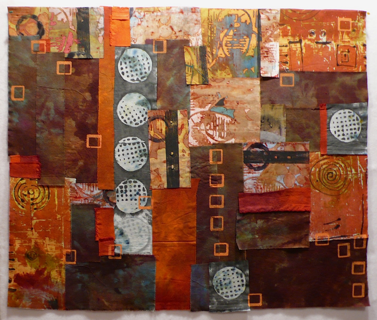
But for what I do? For wall art where its not a concern and I'm already throwing a ton of different things at the work? I've no issue with the little bit of stiffness added to it. In fact, I grabbed one of my in progress Remnant Collages, attached the fine tips to a couple of colors and added some details.

These collages are dependent on layering and that was one of the reasons I got excited about the different attachments for the bottles. Anything that makes my life easier is aces in my book. Here is the one I played on a little bit this morning:


Here are close ups on the parts that I doodled on with the paint:


All in all, I love it. The color range is outstanding, the attachments for the bottle work really well and its really clear that the line was developed by crafters. They gave consideration to just about everything.

You can do a lot more with the paint then what I did. Check it out here for all the nitty gritty (use it as spray paint, she has a glitter and high gloss line, different tools, etc). This is a line that I'll be using in my work a lot, I can already tell.

where i stand sunday


Puddled, dark, laced with cold. The season is turning with a moodiness that saturates everything, heavy and damp. It lays down a thick want for all things layered and warm and sheltered.


Where I Stand is an ongoing photo essay examining the different places I spend my life standing. Too often we take for granted the everyday places we spend our lives walking on. The ground we tread on has its own stories to tell.

01 October 2011

thinking about longevity


In my last post I gave a mention to Eco Colour. The question was posed to me on facebook about whether or not I was worried about the longevity of the natural dye on the fabric.

My answer in a nutshell is nope, not at all.

The question of what we as fiber artists can expect in terms of life span for our work is always a subject for debate. Considering all the processes that we subject our work to, specifically when you are a surface design artist, trying to keep track of what will cause the fibers to break down and what won't can be a daunting task.

Here's the thing - I do my best to do right by the fabric I use but I've no interest in making sure that it lasts for a thousand years. (I'd be a wee bit frightened of what that might take to be honest.)

I think its inherent in any medium that there are things that will cause the work to decay and break down over time. Some artists even work to accelerate that process and make it the focus of their work. Take Jude Hill over at Spirit Cloth for example. Her work is so spiritual and undeniably beautiful and she uses decay as one of her primary surface design techniques.

I'm not saying you should abandon good practices. Dumping a bottle of straight up bleach on fabric and not bothering to neutralize it would most likely result in a mucky mess but I'm not going to worry about every tiny thing that I do.

That really sucks the joy out of things.

Consider this: I love crazy quilts. They were my first exposure to art quilting and I have a small collection of them. I had one of them appraised because I was interested in finding out how old it was. Some of the fabric used in the piece was dated back to the 1830s.

Didn't look too shabby either. Now we're talking about a quilt that was not specially conserved, in fact it came out of someone's basement. The fabric was well over one hundred years old and was still going strong. Not as vibrant or solid as when it first came into existence of course but not in shreds by any means. And this was during a time when dye processes could be incredibly brutal and no one gave a thought to how long anything would last.

So what's the point of this post? My point is to create the work you want. Don't let every tiny concern get in your way, its just another excuse for not making the work. Keep a reasonable eye on good practices but loose yourself in the magic of what you're making, that's always the most important element.